
Unsupervised Learning - An Exploration
Unsupervised Learning and Dimensionality Reduction
Evan Loughlin
Index Terms machine learning, unsupervised learning, dimensionality reduction, clustering, K-Means Clustering, Expectation Maximization, ICA, IPA, Randomized Projections, t-SNE
I. Introduction
Unsupervised learning is a form of machine learning where algorithms discover patterns in data without being given explicit labels or targets. The goals of unsupervised learning is to find hidden structure and patterns in data, such as grouping features, finding similarities, and explaining variability in data.
Dimensionality reduction is a type of unsupervised learning used to reduce the number of features in a dataset. This is often done by finding lower-dimensionality representation of the same data, which captures the most important patterns and relationships. Dimensionality reduction is often used as a pre-processing step for machine learning tasks where the high dimensionality of the data can lead to overfitting or other computational challenges.
The purpose of this report is to study unsupervised learning and dimensionality reduction experientially in order to gain a deeper insight into how they work. Two datasets are introduced, and they are used to demonstrate the effects of a set of algorithms. In particular, two clustering algorithms are considered (K-Means Clustering and Expectation Maximization). Four dimensionality reduction algorithms are studied: Principal Component Analysis (PCA), Independent Component Analysis (ICA), Randomized Projections (RP), and t-Distributed Stochastic Neighbour Embedding (t-SNE).
II. Methods
The analysis in this study is focused on experientially working with datasets to elicit behaviour and limitations of the various algorithms studied. In particular, this study is broken down into five parts:
-
An analysis of Clustering Algorithms on the original datasets
-
An analysis of Dimensionality Reduction on the original datasets
-
An analysis of Clustering Algorithms on datasets after dimensionality reduction
-
Neural Network Comparison: MNIST Digits Dataset after Dimensionality Reduction Only
-
Neural Network Comparison: MNIST Digits Dataset after Dimensionality Reduction and Clustering
This report is an exploratory analysis, whereby interesting results are discussed to varying degrees. Due to the highly intractible nature of the many permutations possible with each possible algorithm, and the large number of possible graphs, analytics are carefully selected to try to highlight the interesting behaviours. Graphs used for analysis include Pairwise plots, heatmaps, dendograms, clustering scatterplots, and others. The metrics used to compare similarity / distance are explained throughout the report where used.
III. Datasets
Two labeled classification datasets were selected for testing and experimentation. These datasets differ in a multitude of ways, as discussed below. The intention behind selecting datasets that differ in several ways is driven by the goal of eliciting differences in behaviour and performance across the selected algorithms in order to better highlight and understand algorithmic differences. These two same datasets were selected in the original Supervised Learning report section of this course.
A. Handwritten Digits Data Set
The first dataset selected is a handwritten digits dataset [3]. Each image is 8x8 pixels, where each pixel is considered a feature. There are thus 64 features, and the value of each represents the intensity of the pixel as a real number between 0.0 and 1.0 (0 being black, and 1 being white). The classification target consists of the set [0, 1, 2, 3, 4, 5, 6, 7, 8, 9]. The dataset is balanced, in that the number of samples for each class is approximately the same. The total number of samples in this dataset is 3823.
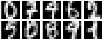
Fig. 1. Visualization of different digits samples
B. Adult Income Prediction Dataset
This dataset [7] consists of 16 features where each row represents a person. Features include discrete traits like ethnicity, country of origin, and education level, as well as continuous features such as income and age. The class being predicted is whether an individual has a salary of greater or less than $50,000 USD each year. This dataset was selected to contrast the digits dataset, as it differs in several ways. For instance, the target class output is binary, the dataset is unbalanced (25% > 50k, 75% <= 50k), and the number of features is comparatively small (16), while the number of samples is comparatively large (apx. 30,000).
C. Why They Are Interesting
From the point of view of unsupervised machine learning, these datasets were selected for the following reasons: Firstly, the MNIST Digits is a classic benchmark dataset in machine learning, widely used for evaluating and comparing different classification, clustering, and dimensionality reduction algorithms. Both datasets are relatively large and complex and contain a high-dimensionality feature-space, making them ideal for exploring the limitations, capabilities, and behaviours of dimensionality reduction algorithms such as PCA, ICA, Randomized Projections and t-SNE. By reducing the dimensionality of the data while preserving their underlying structure, it’s possible to gain insights into the underlying patterns and relationships that are not immediately obvious in the raw data. The datasets differ widely in their application and degree to which individual features relate to one another. The MNIST Digits dataset is balanced with many possible labels, while the Adult database is largely unbalanced with only two classes in the output. For these reasons, they were selected as interesting with regard to dissecting and demonstrating the differences between algorithms.
D. Selecting K
In clustering algorithms, K refers to the number of clusters that the algorithm should try to identify in the dataset. The value of K was determined experientially with the use of a variety of tests and metrics. In order to identify K, care was taken to not strictly relate K to the number of classes in the output space. Essentially, domain knowledge regarding the problem was ignored and the problem was approached in an unsupervised fashion. Specifically, two methods were chosen: The Elbow Method [11], and The Silhouette Method [12].
The elbow method is a technique used to determine the optimal number of clusters in a clustering algorithm. The method involves plotting the within-cluster sum of squares for varying values of K, and then finding the value of K in which the curve begins to plateau or level off, which thus creates a bend in the plot.
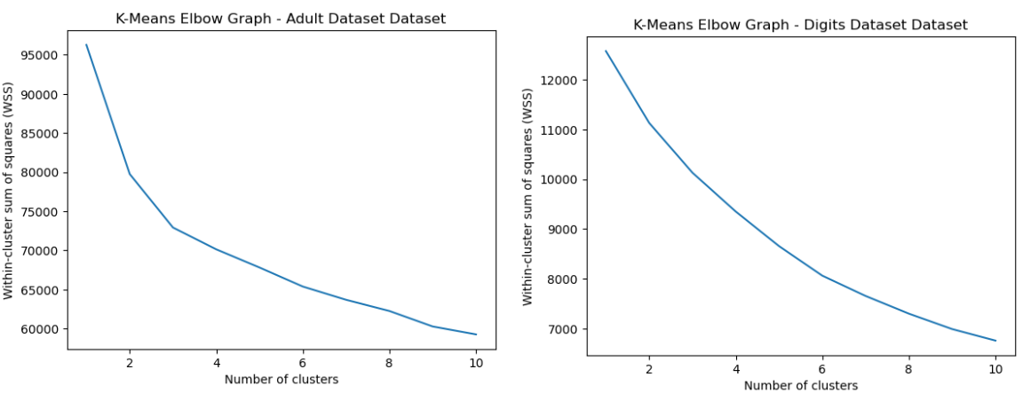
Fig. 2. K Means Elbow Graph Adult and Digits Dataset
From Fig 2, it’s clear to see that an elbow exists for around K=2 or K=3. Thus, the K of 3 was selected for the Adult Dataset. However, for the digits dataset, a clear elbow could not be determined, since the entire curve appears to be relatively smooth. This may be because the digits have different variations in shape, size, and orientation, which could result in a smoother curve with no clear elbow. This may indicate unclear separation between clusters.
The silhouette method provides a measure of how well each point in a cluster fits with the other points in the same cluster. The silhoette score ranges from -1 to 1, where a higher score indicates a better matching. This score is calculated by comparing the distance to other points within its own cluster with the distance to the nearest cluster that the point does not belong to, and is given by the expression s = (b - a)∕max(a,b), wehere b is the average dissimilarity of a data point to all other clusters that it does not belong to, and a is the average dissimilarity of a data point to its own cluster.
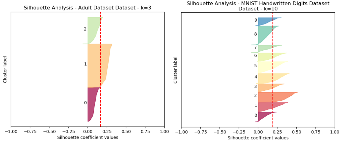
Fig. 3. Silhouette Analysis Adult Dataset (Left) and Digits Dataset (Right)
A comparison of K=2 and K=3 was made for the Adult Dataset, and K=3 was selected as the silhoette score was nominally greater. (Fig 3). It is notable that the first two clusters have a greater silhoette score than the third.
This same silhoette analysis was performed for a range of K 1 thru 15 for each datasets, and each of the scores were tracked. It was determined that for the Digits dataset, the peak silhouette score occurred at K=10.
The K was selected without reference to the actual labels. Now, we can reflect on whether it performed well. The K=10 for the MNIST Digits Dataset was not surprising, since there are 10 digits in the dataset that are being identified. This indicates that the algorithms performed well in terms of determining the natural clustering of the original, unmodified datasets. For the UCI Adult dataset, there are only 2 possible classifications. Interestingly, a K=3 was selected, indicating that despite there only being two separate output classes, there may be more natural clusters or hidden structure in the data. It can be seen however from 3, for the Adult dataset, that the third cluster selected does have a considerably weaker silhoette score than the other two, which might presumably indicate the positive / negative cases in the labeled dataset.
IV. Clustering Algorithms
For each of the datasets, the clustering algorithms were performed on the data with the specified K values.
A. Digits Dataset
For the digits dataset, the Heatmap was used as a method to identify groupings and similarity between metrics. It’s a graphical representation of a matrix, and in the case of clustering algorithms it can reveal patterns of similarity or dissimilarity within and between clusters [8]. This allows you to see how well the clustering algorithm has separated the data points and whether there are any subclusters or outliers that might need further analysis. In this heatmap (4), a dendogram is associated, which helps show the heirarchical relationships between objects or groups of objects. This can be useful for representing the way that different clusters are formed from the data. Heatmaps were used for the Digits dataset, due to the high degree of dimensionality, whereas the Adult UCI dataset contains far fewer individual features. For that dataset, analysis was conducted by comparing pairwise plots. Pairwise plots are useful for visualization because they allow us to examine the pairwise relationships between multitude of variables in a dataset, which provides a comprehensive view of the correlation structure within the dataset. They also help us understand patterns and clusters in the data. Similarly, it can help us identify linear or non-linear relationships throughout the different variable combinations.
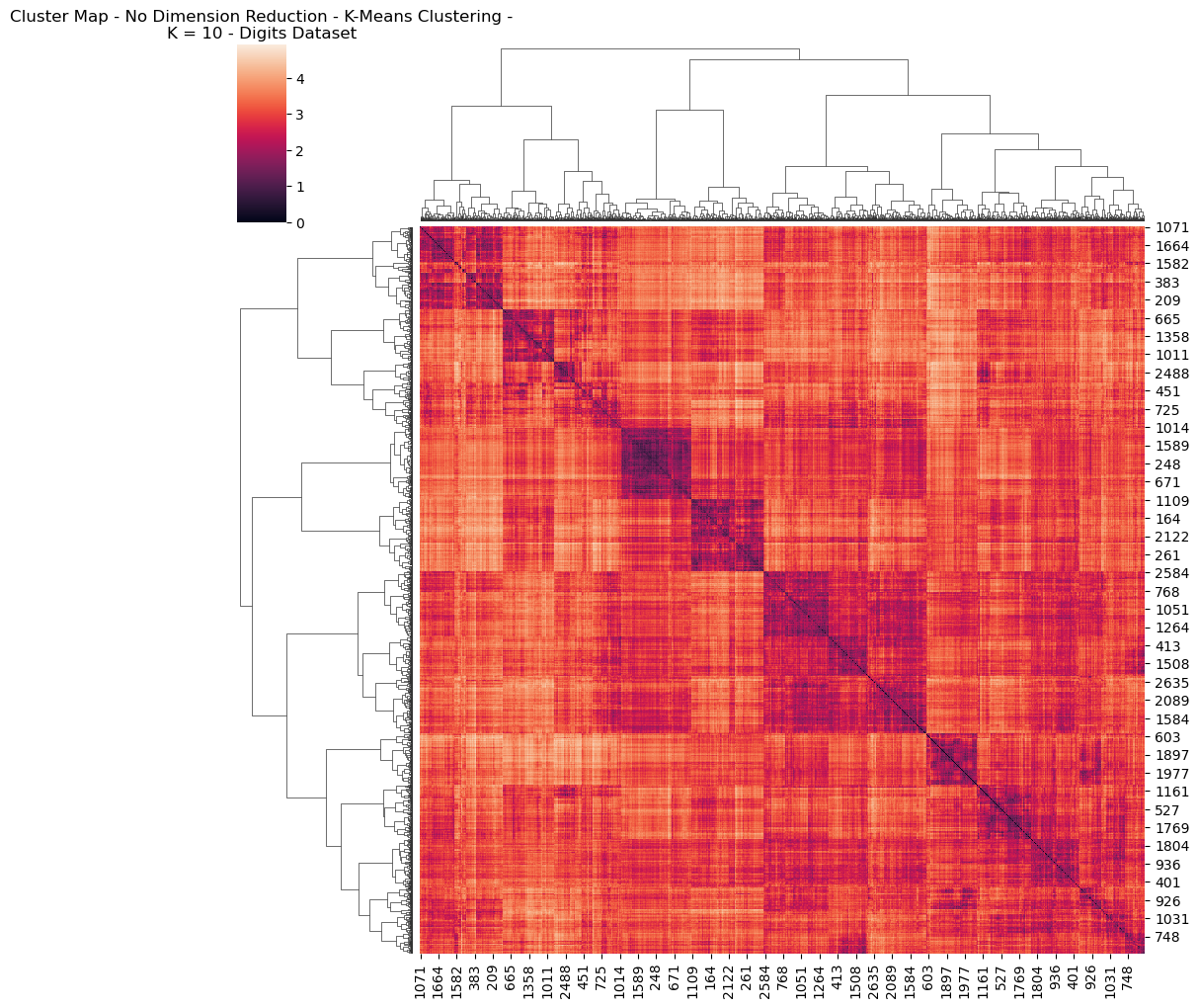
Fig. 4. Cluster Map No Dimension Reduction K Means Clustering K 10 Digits Dataset
A comparison was conducted between K-Means and EM Clustering in order to try to elicit different behaviours between them, experientially. These two algorithms exhibit several key differences [4], for example:
-
Objectives: K-Means’ goal is to minimize the sum of squared distances between datapoints, as well as their nearest cluster centroids. EM, however, maximizes the likelihood function that describes the probability distribution of data.
-
Soft vs Hard Clustering: K-Means is hard; meaning each data point is assigned to exactly 1 cluster. EM, however, performs soft clustering meaning that each datapoint has a probability of belonging to each cluster
-
Convergence: K-Means is guaranteed to converge to a local minimum, which might not be globally optimal. EM can also converge to a local maximum, but it can often be more flexible and capture more complex data distributions.
With these differences in mind, let’s try to explore some of the graphs. Interestingly, the visual differences between the HeatMaps between EM and K-Means for the Digits dataset were negligible. This means that both algorithms likely converged upon a very similar representation of the clustering / structure of the data. For this reason, only a single graph was included (Fig 4) Reviewing this Heatmap, it’s visually possible to identify simiilarities in colour possibly representing each of the 10 possible digits. There’s a larger cluster containing three sub-clusters, which might, for example represent how 0’s share much in common with 8’s and 9’s, in terms of structure.
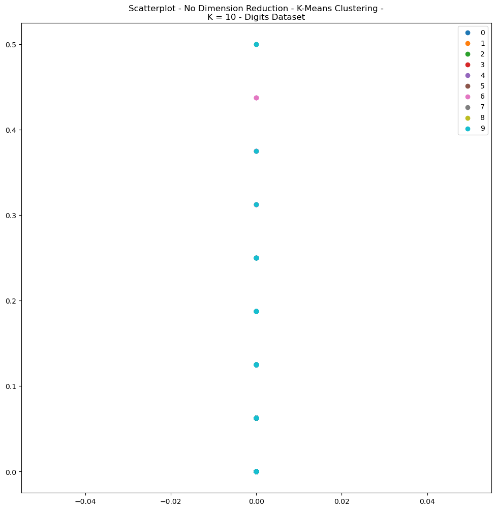
Fig. 5. Scatterplot No Dimension Reduction K Means Clustering K 10 Digits Dataset
A review of the scatterplots for the Digits dataset (Figs 5) depict relatively unhelpful results, since the datasets were not condensed with dimensionality reduction. The high dimensionality of the digits dataset, for example, makes the visualization of data exceedlingly difficult. The curse of dimensionality means that the distance between any points tends to become very large, making it difficult to detect meaningful clusters in the data. For the sake of brevity, only the plot for K-Means Clustering for the Digits Dataset was presented (Fig 5).
B. Adult Dataset
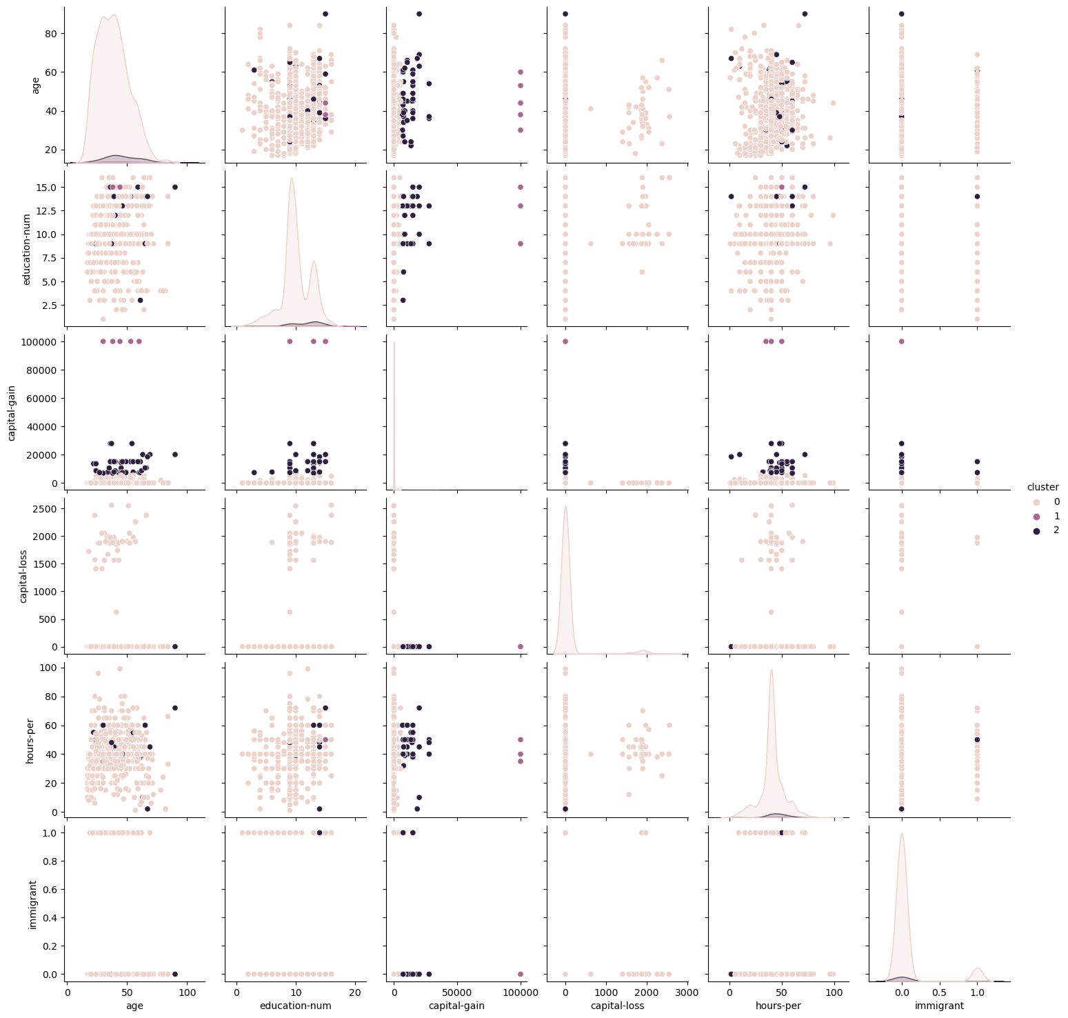
Fig. 6. K Means Clustering Pairwise Plots Adult Dataset
For the Adult Dataset, a finer look at the correlations between each of the variables was conducted using Pairwise plots. For conciseness, only the EM pairwise plot was included (Fig 7). It is notable from this graph that correlation scores were relatively low for different features, indicating that most features are not closely correlated with one another. Similar to what was discussed before, the K-Means algorithm showed more condensely identified clusters within each of the features, whereas the EM graph shows greater flexibility in accepting wider ranges within each cluster.
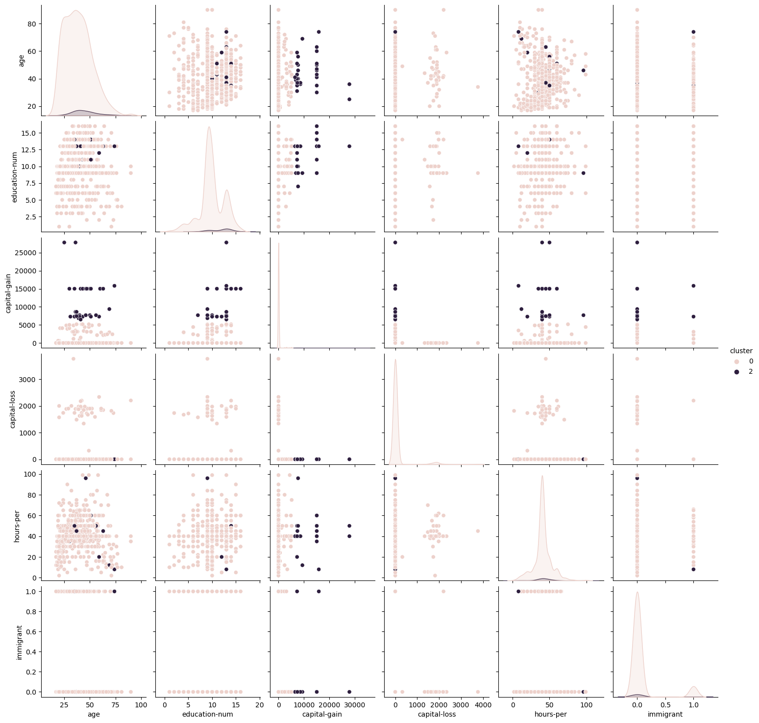
Fig. 7. Expectation Maximization Pairwise Plots Adult Dataset
The scatterplots for the Adult Dataset show similarly difficult to visualize data for the same reasons identified above, although given that the Adult Dataset has fewer features, it displays some dimensionality. The K-Means
The scatterplots for the Adult Dataset show interesting results; notably whether the selection of K=3 was wise. The two algorithms demonstrated vast differences in how clusters were selected. K-Means established a third group at greater distance from the others, whereas EM accepted a large cluster that accepted both eccentric values and a large portion of the blob on the left. This may be indicative of the soft, more flexible clustering approach previously mentioned. Again, however, useful visualization is difficult with these graphs. The shape of each graph was identical since the underlying data did not change structure or dimensionality, only different clusters were selected. Both plots are shown side-by-side in Fig 8.
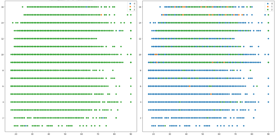
Fig. 8. Scatterplot No Dimension Reduction - Expectation Maximization (Left), K-Means Clustering (Right)
V. Dimensionality Reduction Algorithms
In this section, no clustering algorithms were run. Instead, this section focuses on the results of dimensionality reduction algorithms alone.
| TABLE I | Dimensionality Reduction Algorithm Times (Seconds) | |
|---|---|---|
| Adult | Digits | |
| ICA | 0.081 | 0.002 |
| PCA | 0.010 | 0.001 |
| RP | 0.002 | 0.001 |
| t-SNE | 92.711 | 7.242 |
As seen from Table I, the times required to perform dimensionality reduction varied greatly. The t-SNE algorithm took orders of magnitude longer than the other three. The analysis of this section was conducted by reviewing the scatterplots generated by each of the algorithms in order to compare how the structure of the data changed. Additionally, for each of the DR algorithms, further individual analysis was performed due to the unique nature of each algorithm in terms of what’s possible to assess and compare.
A. Principal Component Analysis (PCA)
PCA is a DR technique that works by transforming a set of correlated variables into a set of uncorrelated variables called principal components [10].
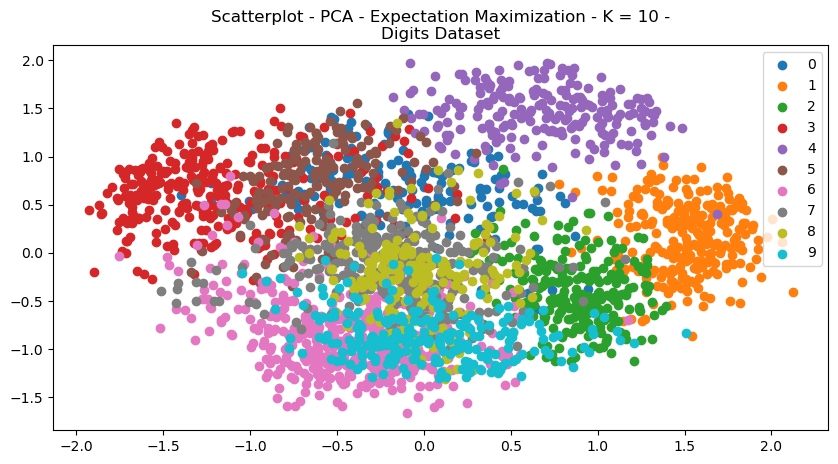
Fig. 9. Scatterplot PCA Expectation Maximization K 10 Digits Dataset
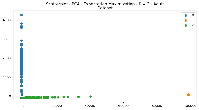
Fig. 10. Scatterplot PCA Expectation Maximization K 3 Adult Dataset
Figures 9 and 10 demonstrate the scatterplot structural changes made to the datasets. It can be visually seen that the data is more organized intro more discrete clusters. Visually, the data appear to be more separated and unified. The explained variance graph (Fig 11) helps determine how many principal components to explain a large portion of the dataset. It’s a useful metric for analyzing dimensionality reduction, since it helps determine how much of the original feature set is useful in explaining data.
A rule of thumb is that you can keep the principal components that explain 80% of variance [6]. This means that for the digits dataset, it may be possible to reduce to the first 40-50 principal components. Since the digits’ features refer to pixels, this may mean that downsampling or size reduction of images, for example, may still yield successful results in learning.
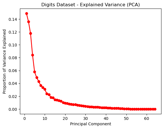
Fig. 11. Explained Variance (PCA) - Digits Dataset
Figure 12 shows the explained variance for the Adult Dataset, demonstrating that the cumulative explained variance of 80% appears when principal components = 4.
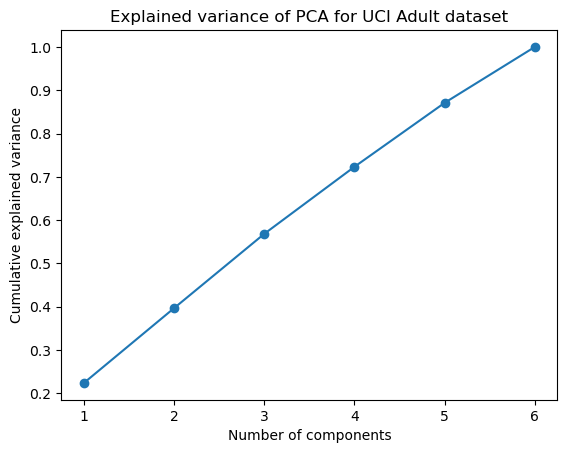
Fig. 12. Explained Variance (PCA) - Adult Dataset
B. Independent Component Analysis (ICA)
In contrast to PCA, ICA is a technique that seeks to find a new set of variables, called independent components. These components are statistically independent of one another, and represent underlying sources that can not be observed directly; however they stil contribute to the observed data [5]. A big difference between PCA and ICA is that PCA assumes that data is generated from a set of linearly related variables, where variables are correlated but not always independent. ICA assumes that the data is generated by a set of independent sources that are combined in a linear way to produce the observed data. Therefore, ICA can be more powerful than PCA in separating sources that are non-linearly related to one another.
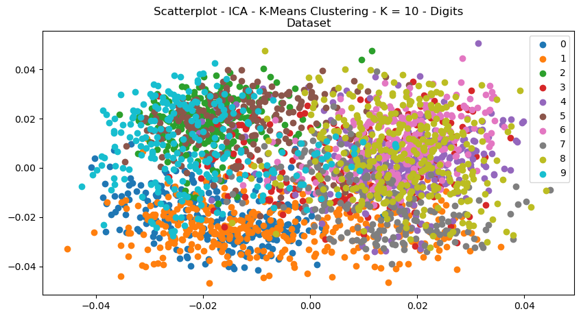
Fig. 13. Scatterplot ICA K Means Clustering K 10 Digits Dataset
Kurtosis is a statistical meausure that quantifies the degree to which a distribution is heavy-tailed or light-tailed compared to a normal distribution. It’s useful for analyzing the non-Gaussian behaviour of independent components obtained from ICA for this reason. High kurtosis means that it has more extreme values than a normal distribution, and low kurtosis means fewer. It can be therefore suggestive of the number of outliers in a dataset.
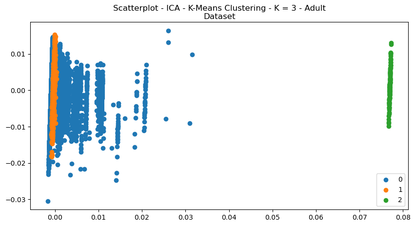
Fig. 14. Scatterplot ICA K Means Clustering K 3 Adult Dataset
The kurtosis values computed for the Digits Dataset and were plotted in histograms (Figs 15, ??). In both datasets, the histograms are skewed to the left. This suggests that some of the IC have light tails and are less non-gaussian than the others. The digits dataset is also bimodal, which might suggest that the independent componets can be separated into different groups with different degrees of non-Gaussianity.
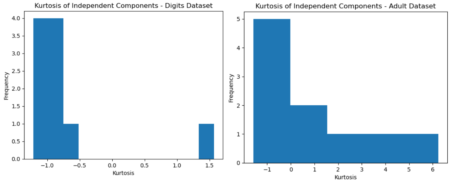
Fig. 15. Kurtosis Histogram - Digits (Left), Adult (Right)
C. Randomized Projections (RP)
Randomized Projections (RP) projects the data onto a lower-dimensional subspace using a random projection matrix. [9] Unlike PCA, RP uses randomization to determine the matrix, which has several advantages. This includes reduced computational complexity and better scalability to large datasets. This likely explains why the time to dimensionally reduce each of the datasets was much faster for RP than any other algorithm.
The shape of the clustered data can be see in the scatterplots in Figs 16 and 17. Reconstruction error is a measure of how well the model is able to reconstruct or approximate the original input data. The Digits Dataset had a reconstruction error of
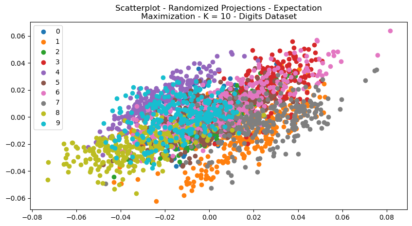
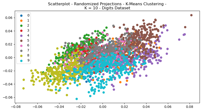
Fig. 16. Scatterplot Randomized Projections Expectation Maximization K 10 Digits Dataset
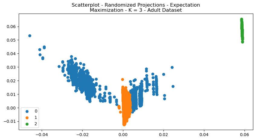
Fig. 17. Scatterplot Randomized Projections Expectation Maximization K 3 Adult Dataset
| Reconstruction Error | |
|---|---|
| Adult | Digits |
| ICA | Very Small |
| Very Large | |
| PCA | Very Large |
| Small | |
| RP | Very Large |
| Small | |
The values of reconstruction error were provided in Table II. Some of the actual values were omitted because the error term can be arbitrarily huge numbers, or nearly zero. The results were highly interesting for a number of reasons. For one, RP, tends to perform better on datasets with lower intrinsic dimensionality, however the dimensionality of the Digits dataset is higher than the Adult dataset, yet it performed much better. This may indicate that the Adult dataset contains a large degree of noise, making it difficult to determine structure and reconstruct from that. The PCA reconstruction error may be very high for the Digits dataset, due to high nonlinearity structure that cannot be well-captured by linear methods. ICA works best on data that is non-Gaussian distribution. The degree of independence between variables also is important. However, the Adult dataset exhibits both of these concepts. Therefore, it might also be indicative that the Adult dataset has a lot of noise which contributes to the high reconstruction error. The t-SNE cannot be assessed for reconstruction error in the same way, since it tries to preserve the local structure of the data, rather than the global structure.
D. t-Distributed Stochastic Neighbour Embedding (t-SNE)
For t-SNE, the metric used to compare and assess the datasets was Kullback-Leibler (KL) Divergence. KL Divergence is a measure of the difference between two probability distributions [2]. The t-SNE algorithm works by trying to preserve the pairwise similarity relationships between original data points. It does so by minimizing the KL divergence between the joint-probabilities between high-and-low dimensional spaces. A low KL divergence indicates that the low-dimensional space preserves pairwise similarities well, while a high value does that opposite. The KL divergences of the Digits and Adult datasets were 0.744 and 0.835, respectively.
The structures of the scatterplots showed interesting results, with large degrees of cleanly separated clusters for each of the datasets.
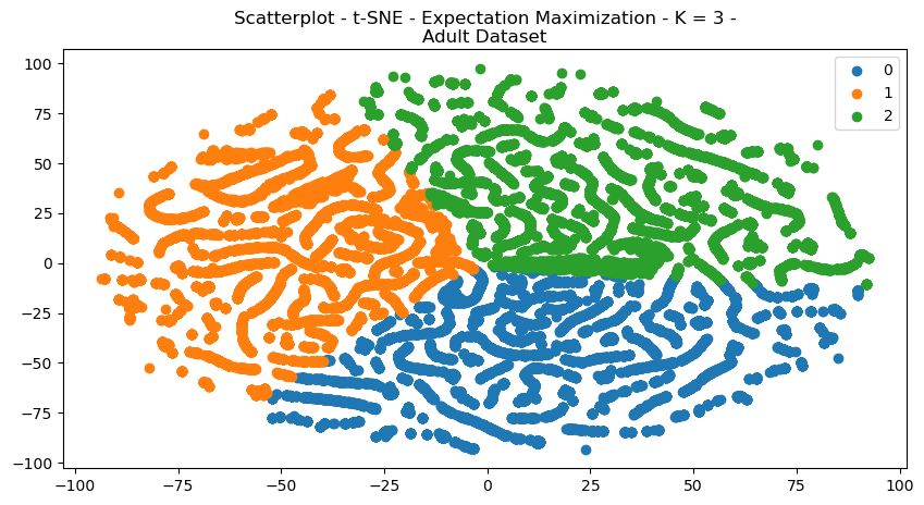
Fig. 18. Scatterplot T SNE Expectation Maximization K 3 Adult Dataset
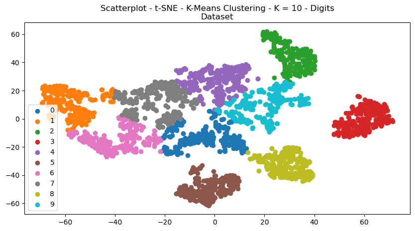
Fig. 19. Scatterplot T SNE K Means Clustering K 10 Digits Dataset
VI. Clustering and Dimensionality Reduction
The clustering algorithms were re-performed for each of the dataset, after having been pre-processed with each of the dimensionality reductions. Each of the scatterplots are provided for visual comparisons and show interesting results both regarding structure and how each of the clusters were selected by either of the clustering algorithms. The structure of the data can be seen in the way in which the data points were re-arranged into various areas, and the clustering algorithms display how clusters were selected based on that dimensionally reduced data.
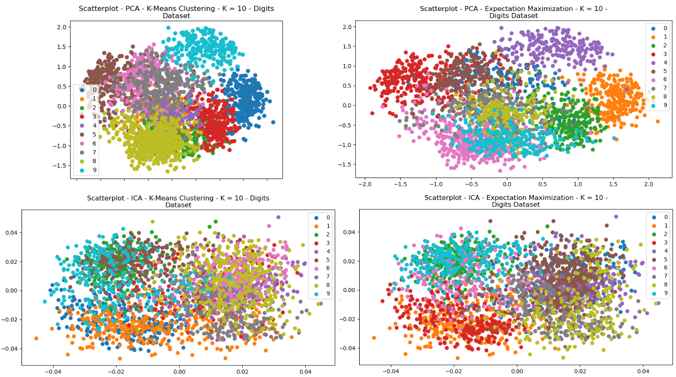
Fig. 20. Scatterplots - (Left = K-Means Clustering, Right = EM) - (Top = PCA, Bottom = ICA) - Digits
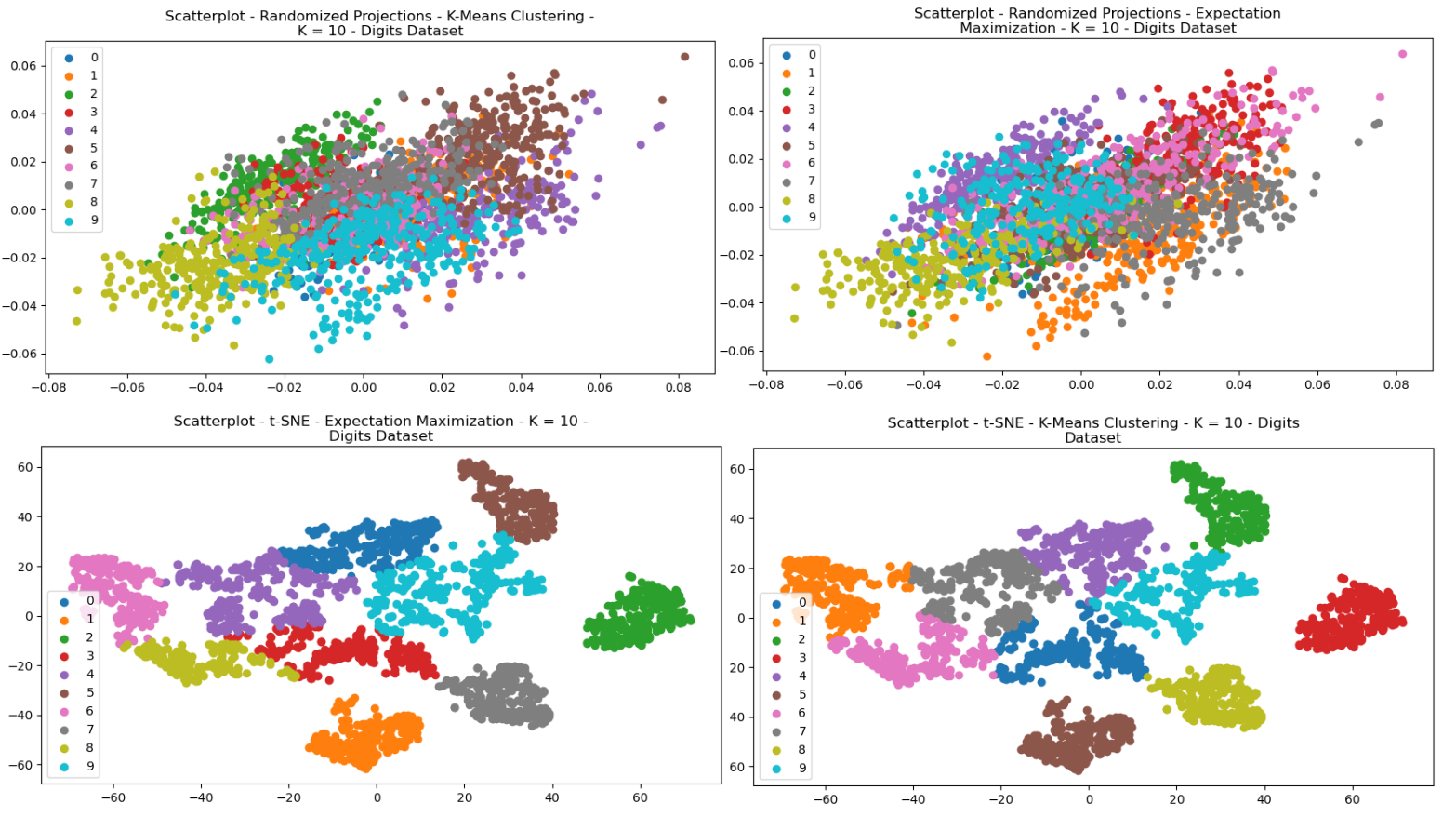
Fig. 21. Scatterplots - (Left = K-Means Clustering, Right = EM) - (Top = RP, Bottom = tSNE) - Digits
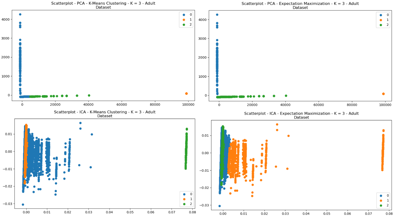
Fig. 22. Scatterplots - (Left = K-Means Clustering, Right = EM) - (Top = PCA, Bottom = ICA) - Adult
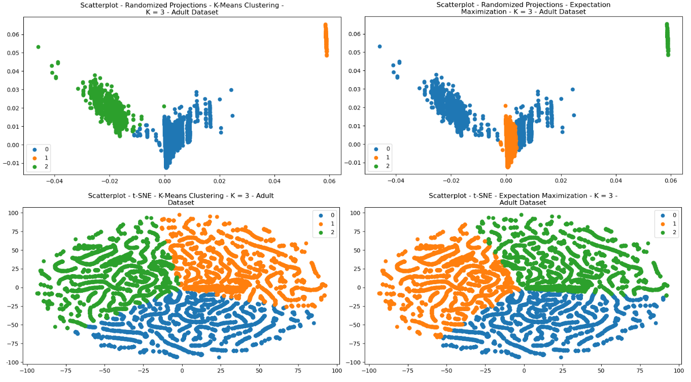
Fig. 23. Scatterplots - (Left = K-Means Clustering, Right = EM) - (Top = RP, Bottom = tSNE) - Adult
In order to compare the algorithms’ performances, several metrics were considered. Silhouette scores were discussed previously. Three other metrics were used: Mutual Information, Completeness, and Homogeneity. Mutual Information (MI) is a measure of similarity, and is it provides a way to measure the degree of association between the clustering solution and the true labeling of the data points. Interestingly, this metric improved for some pre-processing efforts in both datasets, but decreased for others. In the case of decreased scores, this could mean that there was a loss of information that was useful for clustering.
| DR Algo | Clustering | Silhouette | Mutual Information | Comp. | Homog. |
|---|---|---|---|---|---|
| RP | K-Means | 0.17 | 0.70 | 0.71 | 0.70 |
| EM | 0.16 | 0.75 | 0.76 | 0.75 | |
| None | K-Means | 0.19 | 0.76 | 0.77 | 0.75 |
| EM | 0.18 | 0.79 | 0.80 | 0.79 | |
| ICA | K-Means | 0.10 | 0.05 | 0.06 | 0.06 |
| EM | -0.10 | 0.34 | 0.39 | 0.30 | |
| PCA | K-Means | 0.19 | 0.76 | 0.77 | 0.75 |
| EM | 0.18 | 0.79 | 0.79 | 0.79 | |
| T-SNE | K-Means | 0.64 | 0.92 | 0.92 | 0.91 |
| EM | 0.64 | 0.91 | 0.91 | 0.91 |
Table III
Digits Dataset - Scores
Completeness is a measure of the effectiveness of a clustering algorithm in identifying each of the data points that belong to the same true cluster. Notably, the completeness score drastically decreased for ICA for both the Adult and Digits datasets. Since ICA was run, it’s possible that there was a loss of information. The independent components generated may not necessarily preserve all of the information that is important for clustering. Additionally, ICA may have overfit the data if the number of independent components were too large.
| DR Algo | Clustering | Silhouette | Mutual Information | Comp. | Homog. |
| RP | K-Means | 0.94 | 0.148 | 0.279 | 0.101 |
| EM | -0.10 | 0.016 | 0.019 | 0.014 | |
| None | K-Means | 0.94 | 0.148 | 0.279 | 0.101 |
| EM | 0.62 | 0.039 | 0.069 | 0.027 | |
| ICA | K-Means | 0.48 | 0.018 | 0.020 | 0.017 |
| EM | 0.48 | 0.018 | 0.019 | 0.016 | |
| PCA | K-Means | 0.94 | 0.148 | 0.279 | 0.101 |
| EM | 0.62 | 0.039 | 0.069 | 0.027 | |
| T-SNE | K-Means | 0.36 | 0.009 | 0.007 | 0.014 |
| EM | 0.36 | 0 |
Homogeneity is similar to completeness, except it measures the extent to which all data points in a cluster belong to the same true class. A high homogeneity score means that each cluster contains data points from only one true class. The homogeneity scores appeared to similarly decrease with ICA. Interestingly, the t-SNE greatly improved each of the scores for the Digits dataset. This can possibly be explained because the t-SNE algorithm is good with complex non-linear relationships in data, as would be present in pixels. The local structure preservation aspect of t-SNE would also help in preserving shape, and is also excellent at producing scatterplots for visualization.
Overall, the Adult dataset generally did not see benefits for most of the dimensionality reduction algorithms. This might be because of a large degree of noise (low signal-to-noise ratio) in the data. This could also be because of the degree of differences in the non-normalized data for the Adult dataset (different features containing largely different values). This could also be caused by the unbalanced nature of the dataset. In fact, while some clustering algorithms managed to maintain the same scores for this dataset as with no dimensionality reduction.
Further interesting detail is found in visualizing the Digits dataset for the heatmap and dendogram, having performed dimensionality reduction and clustering (Figs 24, 25). This provides interesting visualization regarding how features are reduced and related to one another.
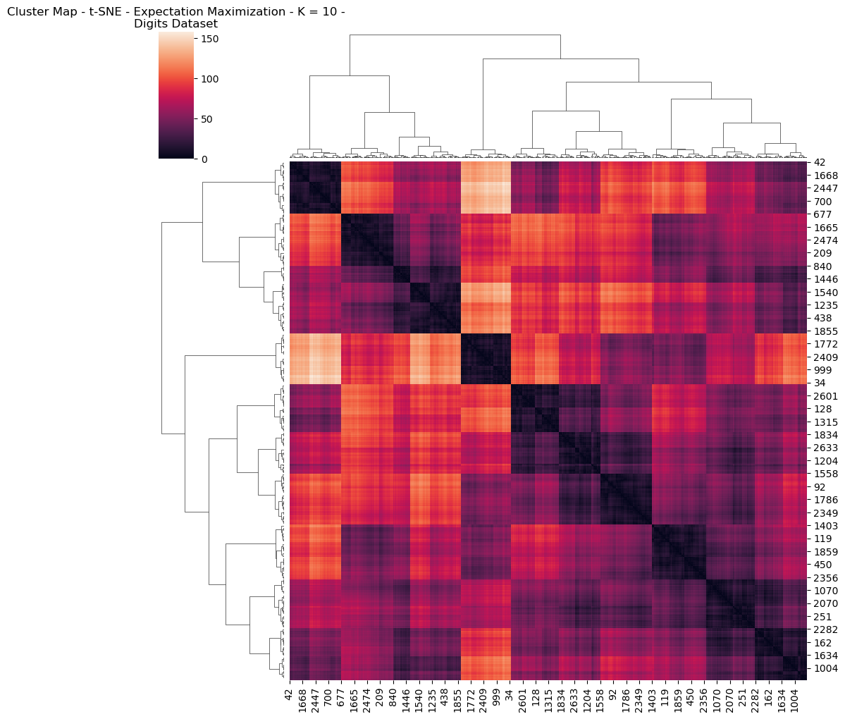
Fig. 24. Cluster Map T Sne Expectation Maximization K 10 Digits Dataset
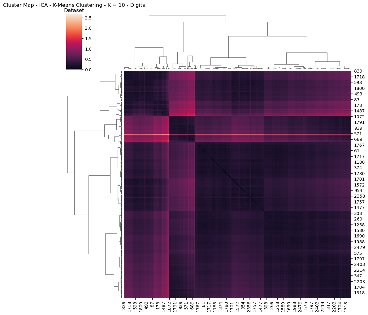
Fig. 25. Cluster Map Ica K Means Clustering K 10 Digits Dataset
VII. Dimensionality Reduction with Neural Networks
In a previous report, the Artificial Neural Network was produced for the digits dataset. Those results were interesting, and found that the accuracy for the Artificial Neural Network was quite good for determining each of the 10 classes. The purpose of this sections is to analyze how dimensionality reduction algorithms contribute to various factors of success for the original neural network.
In order to study the effects of dimensionality reduction on the digits dataset with regard to its performance, several metrics were considered. Firstly, performance was measured with accuracy. Secondly, wall-clock times for finding convergence. Additionally, learning curves were compared to ascertain how quickly each algorithm performed.
The original learning curve of the untrained neural network for the digits dataset are found in Fig 26.
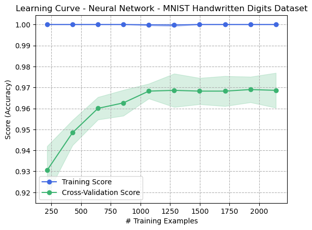
Fig. 26. Learning Curve - Neural Network - Digits Dataset (Original)
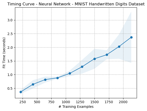
Fig. 27. Timing Curve - Neural Network - Digits Dataset (Original)
The results of the validation curves showed interesting features. Similar to what was seen previously in the metrics analytics, the PCA algorithm performed very well. In face, the variance appears to have decreased after running PCA on the digits dataset. This might indicate that some of the less important deatures were eliminated, meaning that this could help simplify the dataset, reducing noise which might lead to increased overfitting. The rates of convergence also appeared to improve over the based dataset. This appears to be the case regardless of whether clustering was involved. Clustering after the PCA appeared to have no noticeable impact on the result.
As for the ICA algorithm, the accuracy of the algorithm dramatically fell when the ICA dimensionality reduction was performed, but where no clustering algorithm was performed afterward.
VIII. Clustering and Dimensionality Reduction with Neural Networks
Figures 28 and 29 contain the iterative curves for each of the combinations of the Digits dataset having been pre-processed with dimensionality reduction algorithms, and then afterward going through clustering algorithms. Several interesting things emerged from this analysis. FOr Randomized Projections, the three graphs appear identical, meaning that clustering did not seem to have an impact on the performance. When reviewing the corresponding scatterplots, this might suggest that the degree of difference in how the EM and KMeans algorithms selected how the labels associated with the reduced data were highly similar insofar as the Neural Networks could perform the same. This could indicate that the result of the RP algorithm created a transformed dataset that had low correlation between features, since both clustering algorithms made little or no difference.
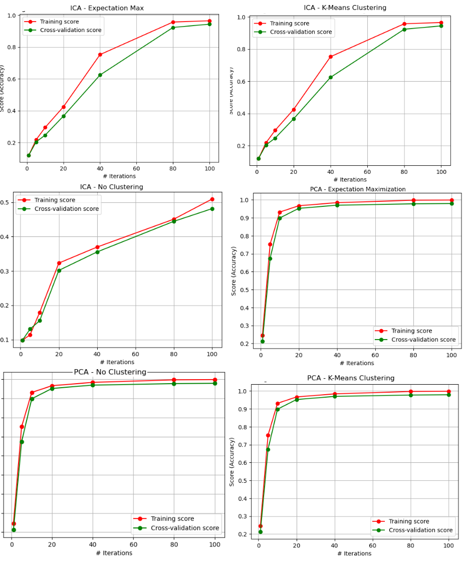
Fig. 28. ANN - Iterative Curves (PCA, ICA - EM, KMC, and No Clustering)
Another important thing that is noticed is that, when comparing the results to the original dataset results, the overfitting was reduced. The training data in the original training curve reached 100%. This means that the generalization ability of the model may have been improved, since overfitting did not occur to the same extent as the original dataset. This is a very interesting finding, and suggests why unsupervised learning is considered so useful in image analysis and computer vision. Clustering algorithms can be used to group images together based on their visual features, such as color, texture, and shape. This can be useful for tasks such as image segmentation, where the goal is to identify and isolate objects within an image [1].
Additionally, the variance greatly decreased in the case of the t-SNE algorithm. This seems to make sense, since the t-SNE results showed the greatest degree of homogeneity and completeness scores, and scatterplots that clearly identified unique clusters for the digits dataset.
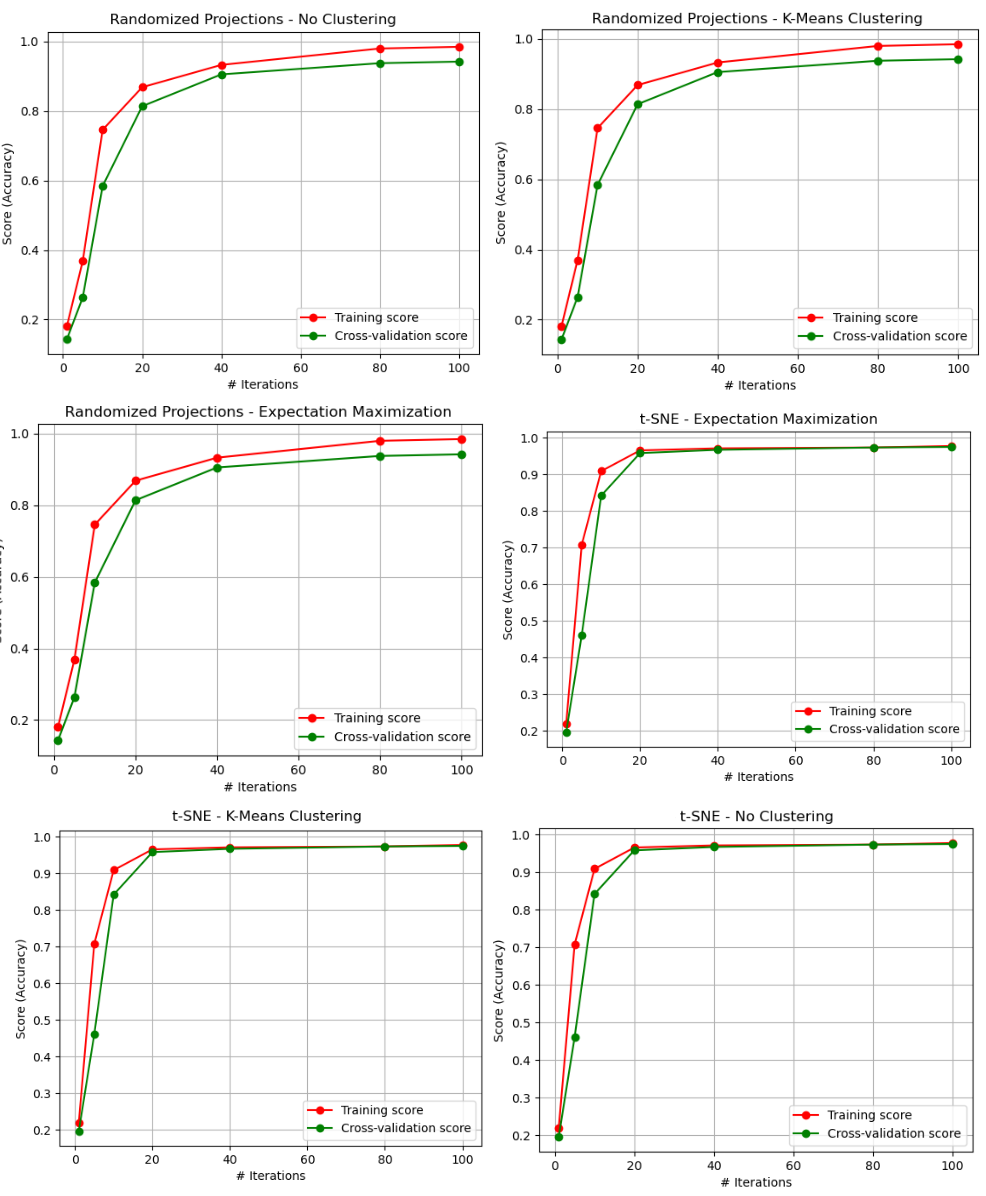
Fig. 29. ANN - Iterative Curves (PCA, ICA - EM, KMC, and No Clustering)
The fit times for each of the neural networks can be found in table V. Interestingly, all three of ICA, PCA, and RP did not appear to create considerable differences in fit times. However, the t-SNE algorithm did so. This may be because of the reduced size of the input data, the removal of irrelevant features, or the general improvement of the quality of the data.
| DR Algo | Clustering Algo | Fit Time (s) |
| ICA | None | 2.55 |
| K-Means | 2.19 | |
| EM | 2.16 | |
| PCA | None | 2.49 |
| K-Means | 2.32 | |
| EM | 2.29 | |
| RP | None | 2.26 |
| K-Means | 2.34 | |
| EM | 2.22 | |
| T-SNE | None | 1.36 |
| K-Means | 1.38 | |
| EM | 1.36 |
References
[1] Aisha Alshamiri and Abdulrahman Albarrak. Image recognition using clustering and dimensionality reduction techniques: A survey. IEEE Access, 9:111338–111356, 2021.
[2] Thomas M Cover and Joy A Thomas. Elements of information theory. In Wiley Encyclopedia of Computer Science and Engineering, pages 1–12. Wiley, 2006.
[3] Li Deng. The mnist database of handwritten digit images for machine learning research. IEEE Signal Processing Magazine, 29(6):141–142, 2012.
[4] Chris Fraley and Adrian E Raftery. Model-based clustering, discriminant analysis, and density estimation. Journal of the American Statistical Association, 97(458):611–631, 2002.
[5] Aapo Hyvärinen, Juha Karhunen, and Erkki Oja. Independent component analysis: algorithms and applications. Neural networks, 13(4-5):411–430, 2000.
[6] Ian T. Jolliffe. Principal Component Analysis. Springer, 2002.
[7] Ronny Kohavi and Barry Becker. UCI adult dataset - machine learning repository, 1996.
[8] Michal Kozubek, Martin Maška, Petr Hušek, Přemysl Matula, Filip Štěpánek, Jan Švihǎk, Carlos Ortiz-de Solórzano, and Arrate Muñoz-Barrutia. Heatmap visualization of single-cell data using nonnegative matrix factorization. Journal of biotechnology, 216:79–80, 2015.
[9] Ping Li, Trevor Hastie, Kenneth Church, and Han Cao. Randomized projections for dimensionality reduction. Journal of Machine Learning Research, 18(1):2778–2816, 2017.
[10] K. Pearson. On lines and planes of closest fit to systems of points in space. The London, Edinburgh, and Dublin Philosophical Magazine and Journal of Science, 2(11):559–572, 1901.
[11] Panagiotis K Polatidis and Michael Georgiopoulos. An elbow criterion for determining the number of clusters in a data set. In Proceedings of the 16th International Conference on Artificial Neural Networks (ICANN), pages 137–146, Athens, Greece, September 2006.
[12] Peter J Rousseeuw. Silhouettes: a graphical aid to the interpretation and validation of cluster analysis. Journal of computational and applied mathematics, 20:53–65, 1987.


Comments